Post
Salesforce “How To” ABCs: C
Posted on February 20, 2019 (Last modified on January 16, 2026) • 4 min read • 830 wordsHow to Create a Dashboard.

Salesforce can seem huge. It’s powerful, flexible, and always growing, always improving. With so many products, features, releases, and updates, it’s easy to forget how to do some of the things that seemed so simple in the first weeks of your implementation.
In today’s post, we’ll continue our trek through the most common (and most commonly forgotten) Salesforce tasks — it’s another installment of the Salesforce “How to” ABCs!
For the letter “C” we’ll be covering how to create a dashboard, so you can keep an eye on all of your important metrics at-a-glance. Let’s jump in!

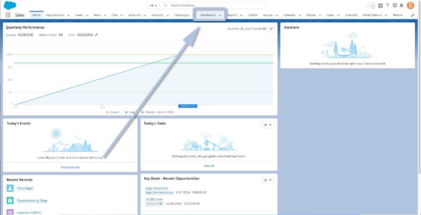
To begin, we’ll need to navigate to Dashboards, so click the appropriate tab at the top of your org.
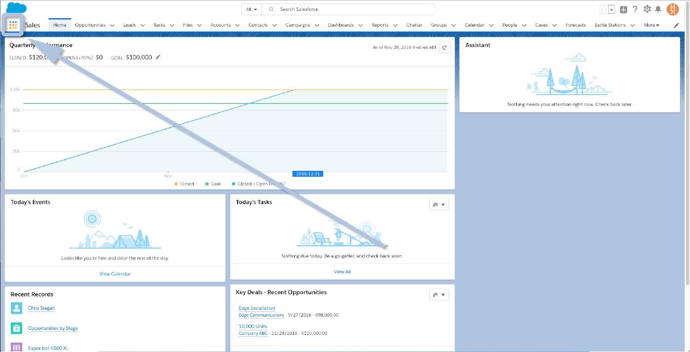
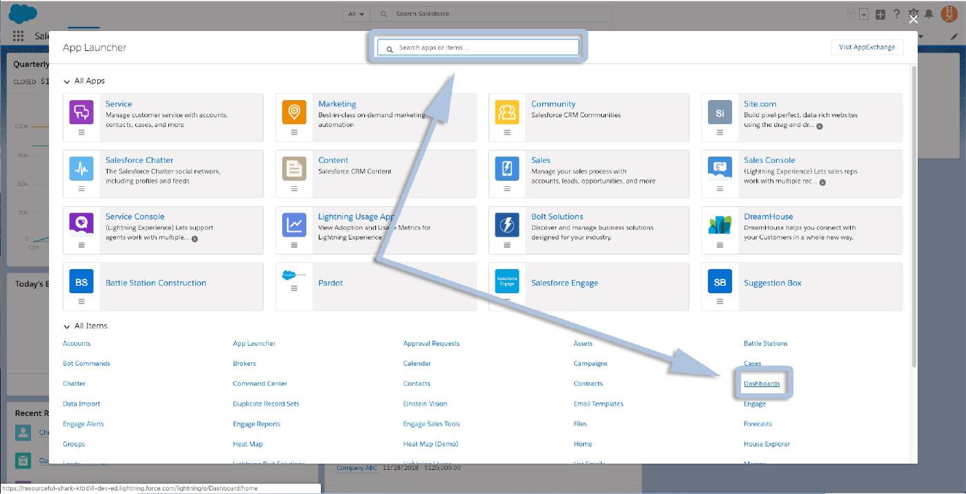
Or, open the App Launcher, and search/select “Dashboards” from there.
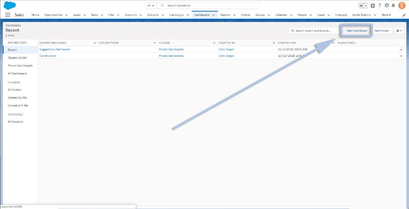
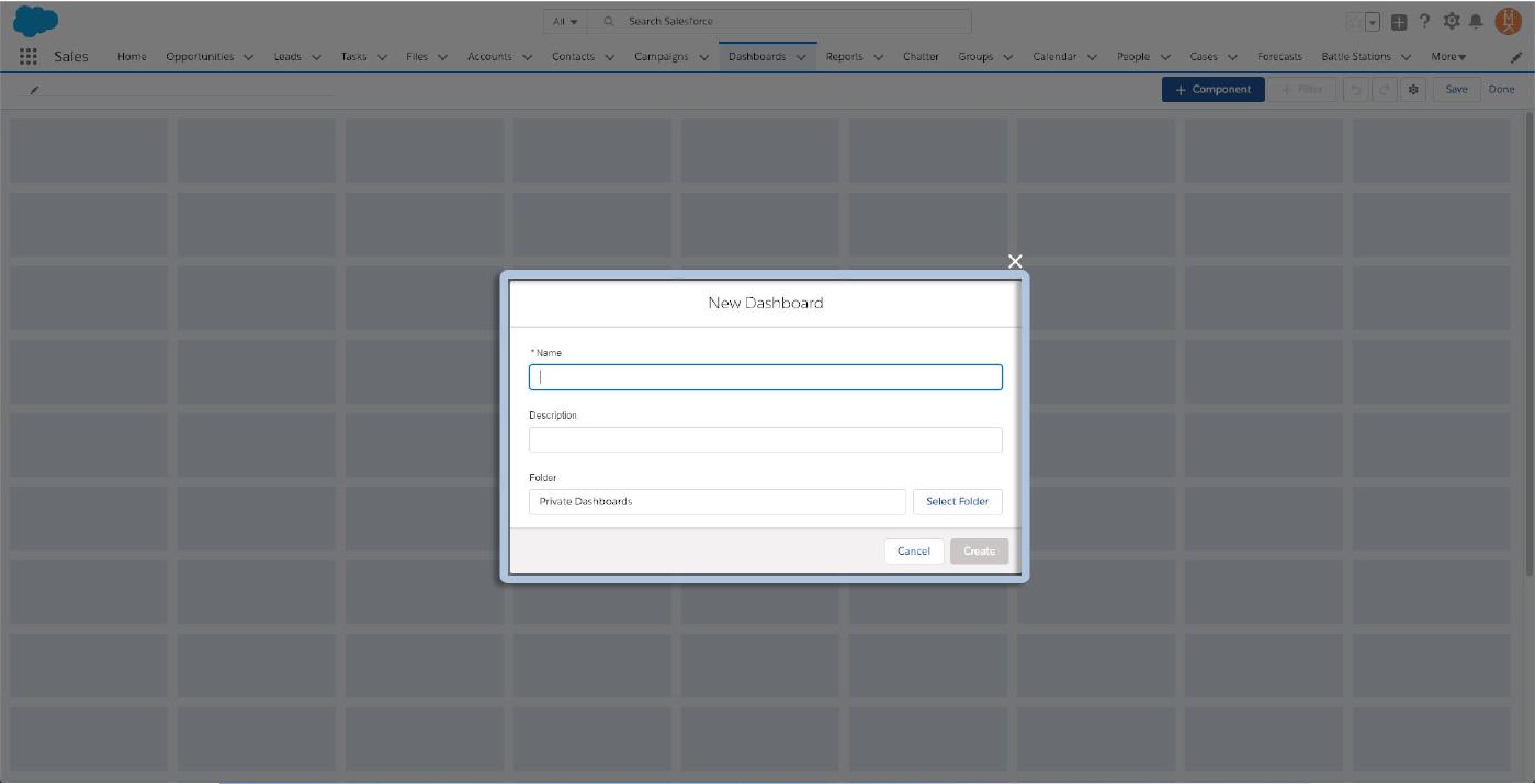
Both methods will land you on your Dashboards page. To create a new dashboard, click the “New Dashboard” button in the upper right corner.
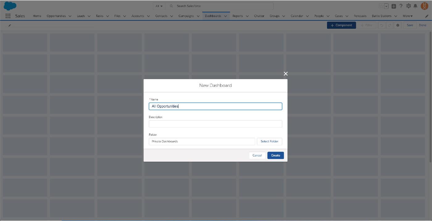
That’ll open the new dashboard dialogue, so begin by giving your new board a name.
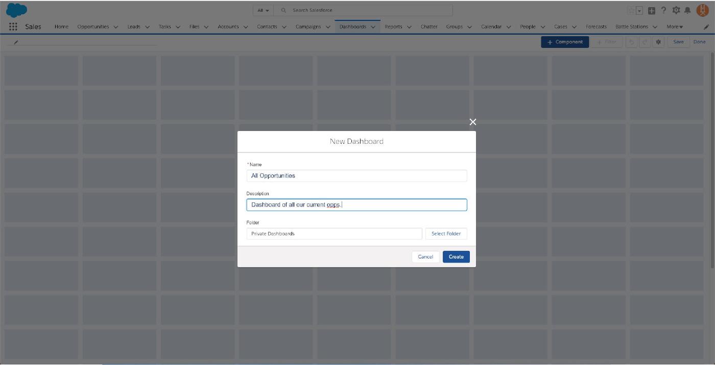
A brief description.
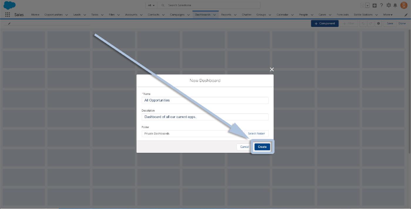
And then click “Create” at the bottom.
And now you’ll see your (currently blank) dashboard. Look at all that real estate for graphs, charts, and figures!
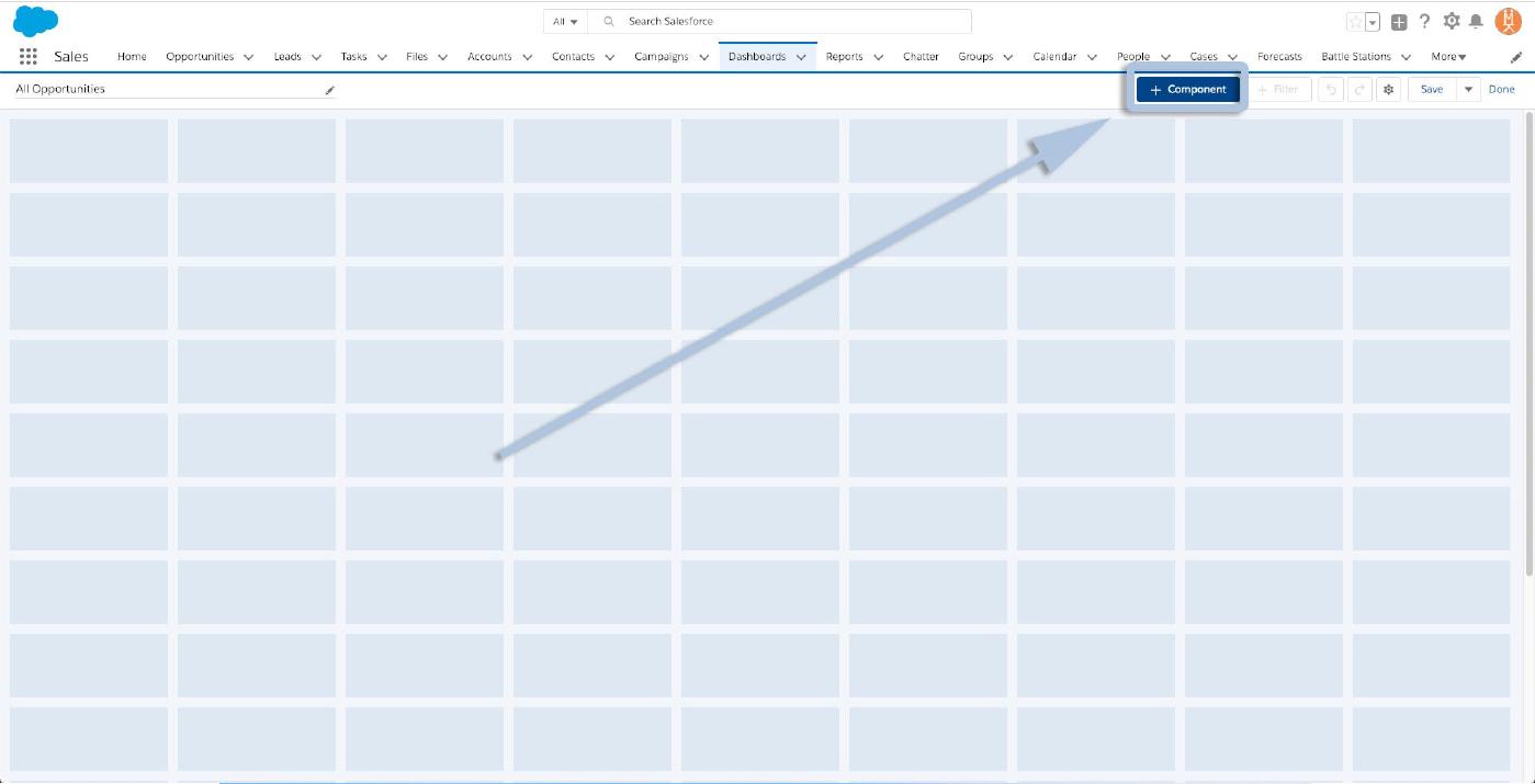
To begin adding assets to this dashboard you’ll need to know which reports you want to summarize and, if you don’t have them yet, you’ll need to create them! (If you need a refresher, pop back to our guide on “building a report”). Once you know what data you’ll want represented, click the “+ Component” button in the top right corner.
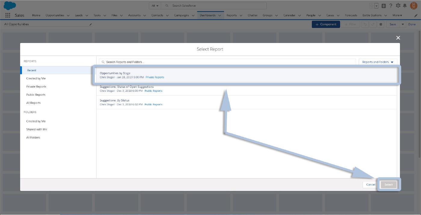
That will pop open the report selection dialogue. Select the first report you’d like to add. For this example, we’ll add the “Opportunities by Stage” report we created in that previous post. Click to highlight your desired report, and then click “Select” at the bottom.
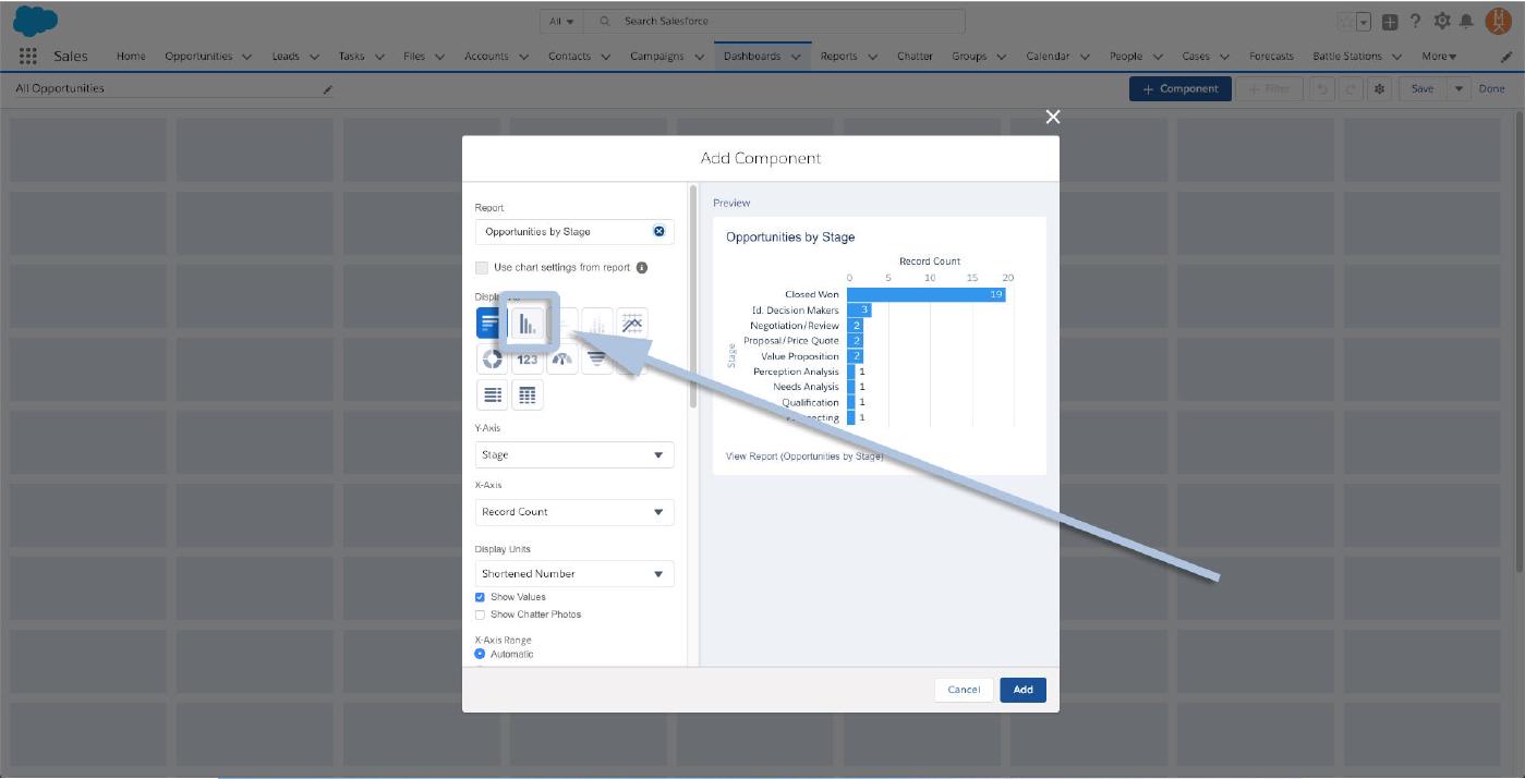
Now you’ll see the Add Component dialogue which will give you all of your options as far as graphs/charts, which data you want on which axis, display units, etc… and a preview of the final product on the righthand side.
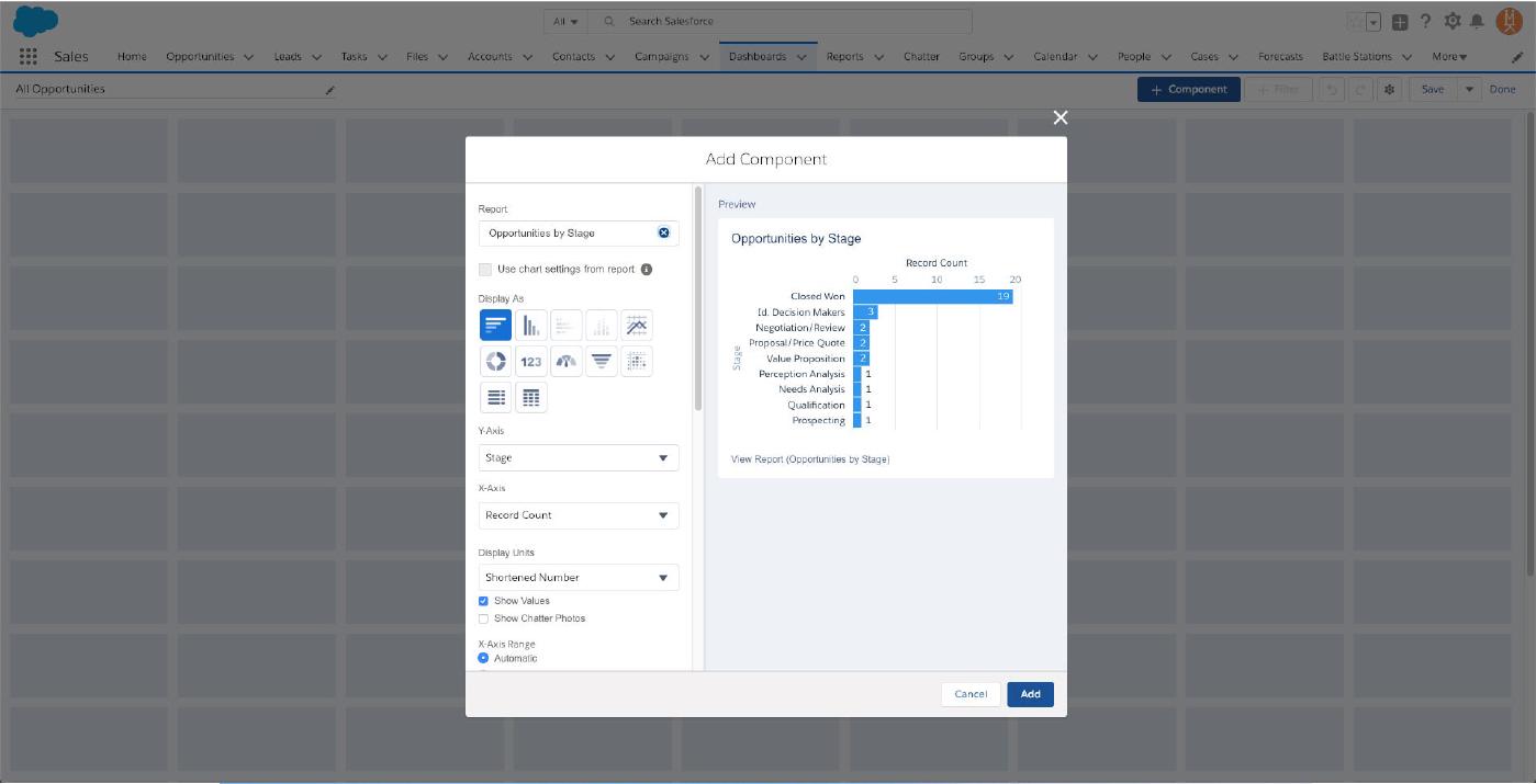
To summarize our report as a vertical bar graph, click the appropriate button under “Display As”.
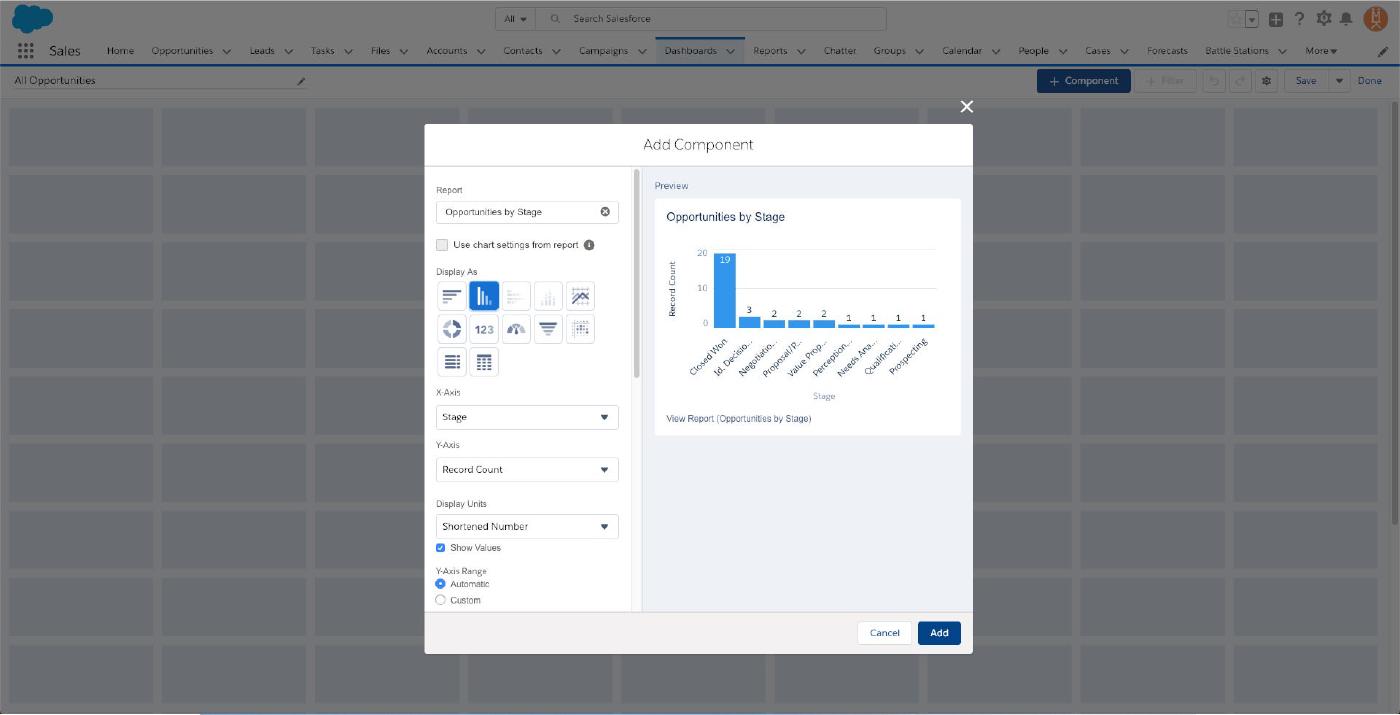
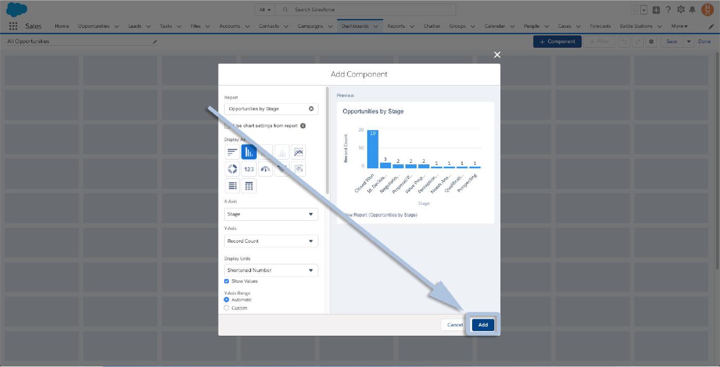
Make any of the adjustments you’d like and, once you’re satisfied with your summary, click “Add”.
And you’ll see your new report/summary widget added to the dashboard!
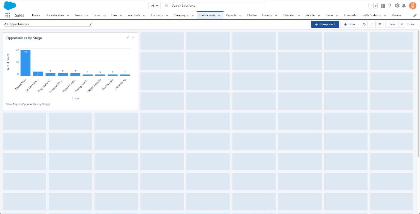
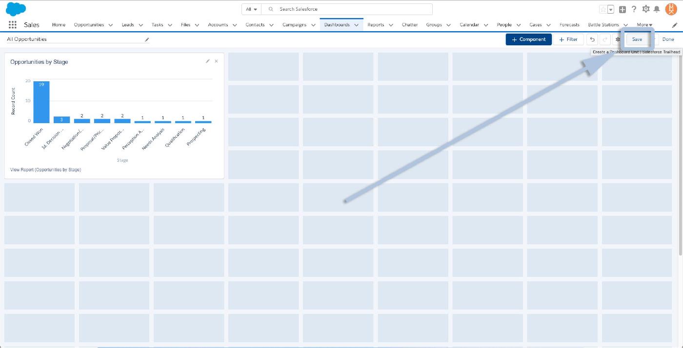
All you need to finalize the dashboard is to click “Save” in the upper right!
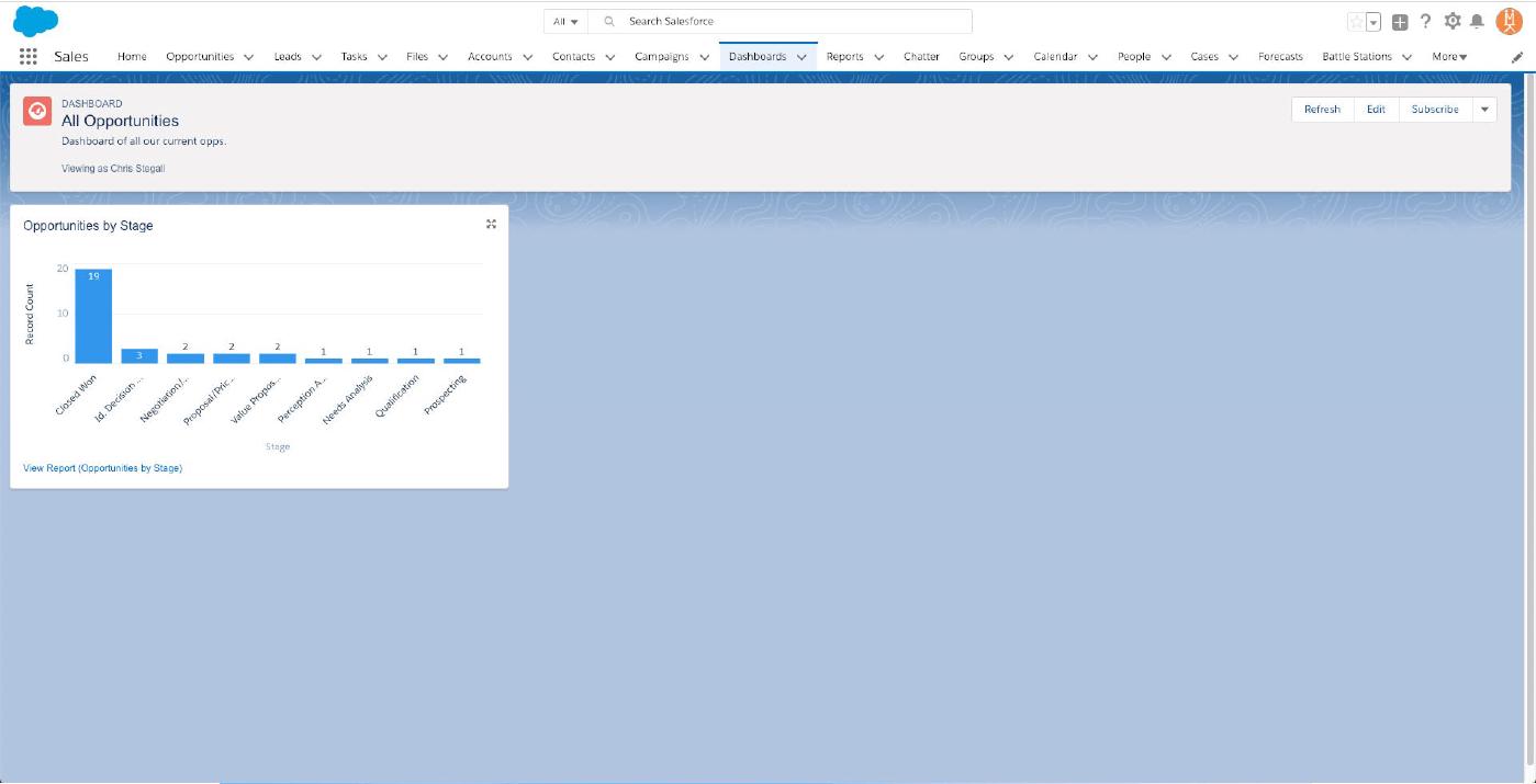
Congratulations! Your dashboard (although a bit sparse) is ready for deployment!
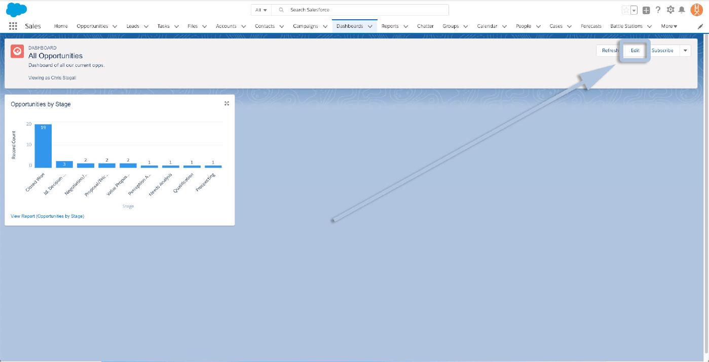
Now, let’s cover making some changes and additions — pretty common once your team starts getting used to seeing their data summarized and gets a feel for the info that would help them be more productive To begin changing an existing dashboard, click “Edit” in the upper right corner.
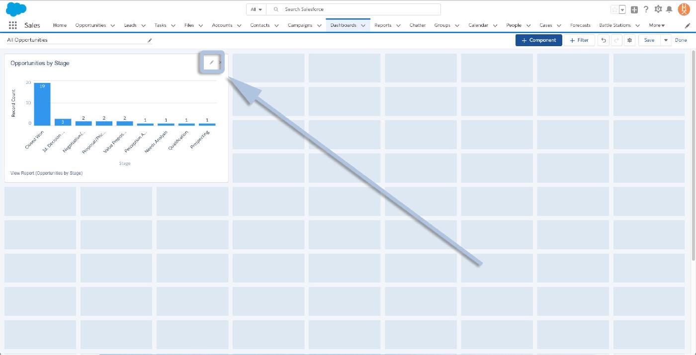
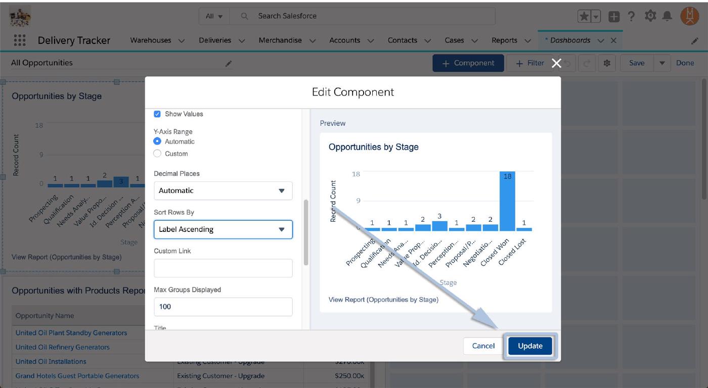
Let’s say your team requested that the stages (x-axis) on that initial report be flipped, so the value’s increase from left to right instead of right to left. To do that, we’ll click the pencil icon above the graph/chart to edit it.
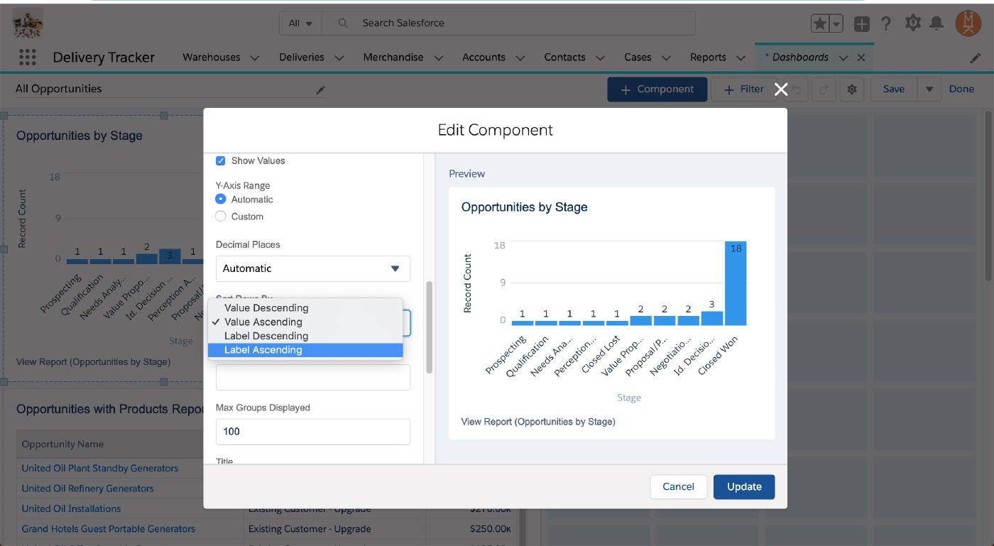
Scroll down the Edit Component dialogue until you see “Sort Rows By”, and change “Value Descending” to “Value Ascending”.
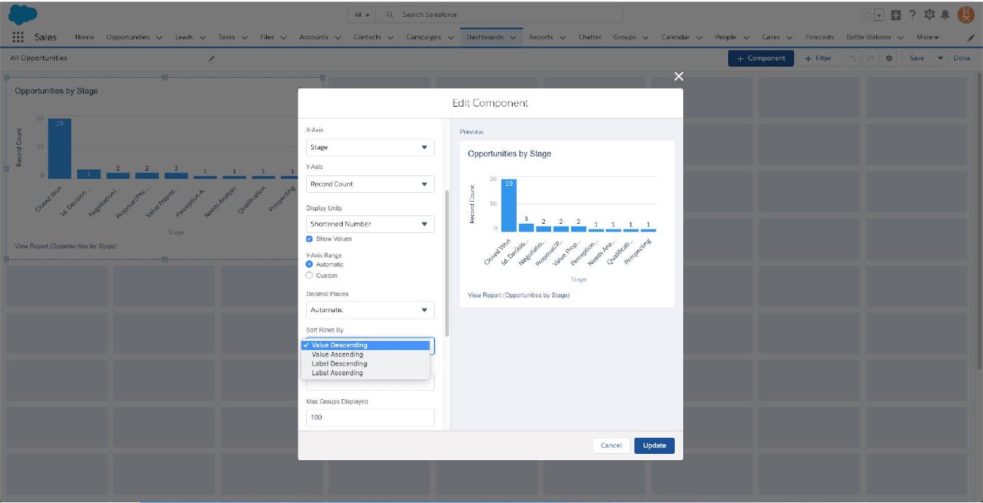
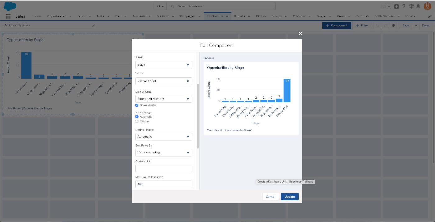
And that’ll flip your graph around! And if you’d prefer to see the fields sorted by their stage in the sales process as opposed to numeric value, choose “Label Ascending” instead!
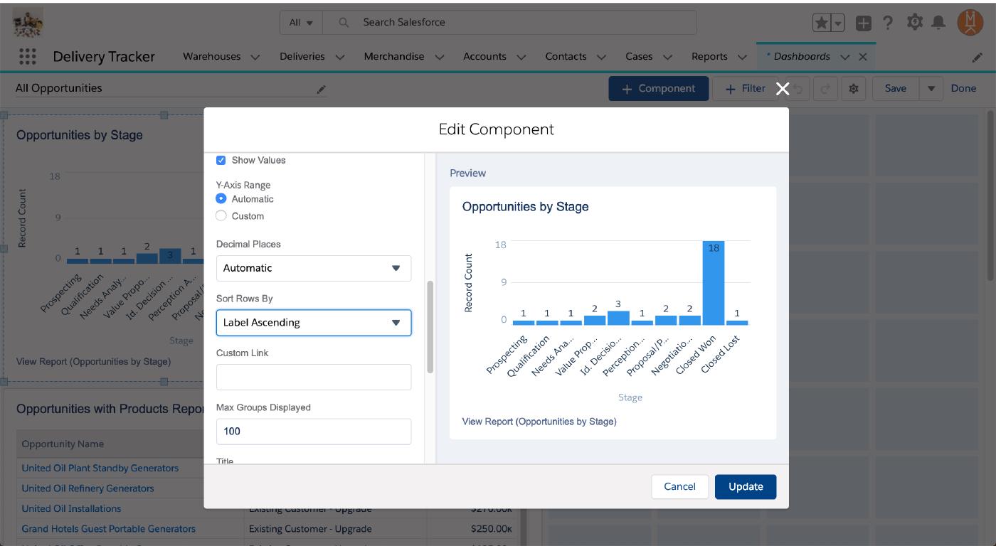
Now you’ve got a nice high-level look at your sales pipeline and how full the funnel is at every stage! Once you’re satisfied with your tweaks, click “Update”.
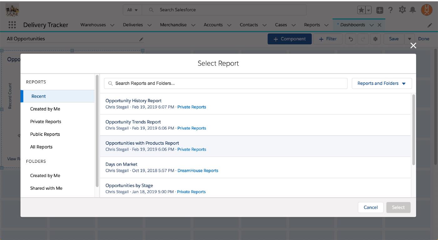
To add some more graphs and charts, click “+ Component” again.
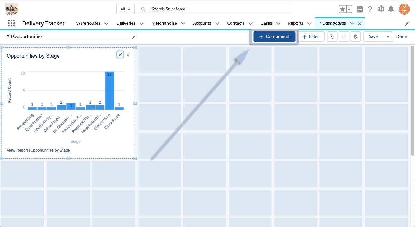
That will, again, open the select report dialogue. Simply highlight and select your additional reports, finalize their graph/chart settings, and click “Add” again.
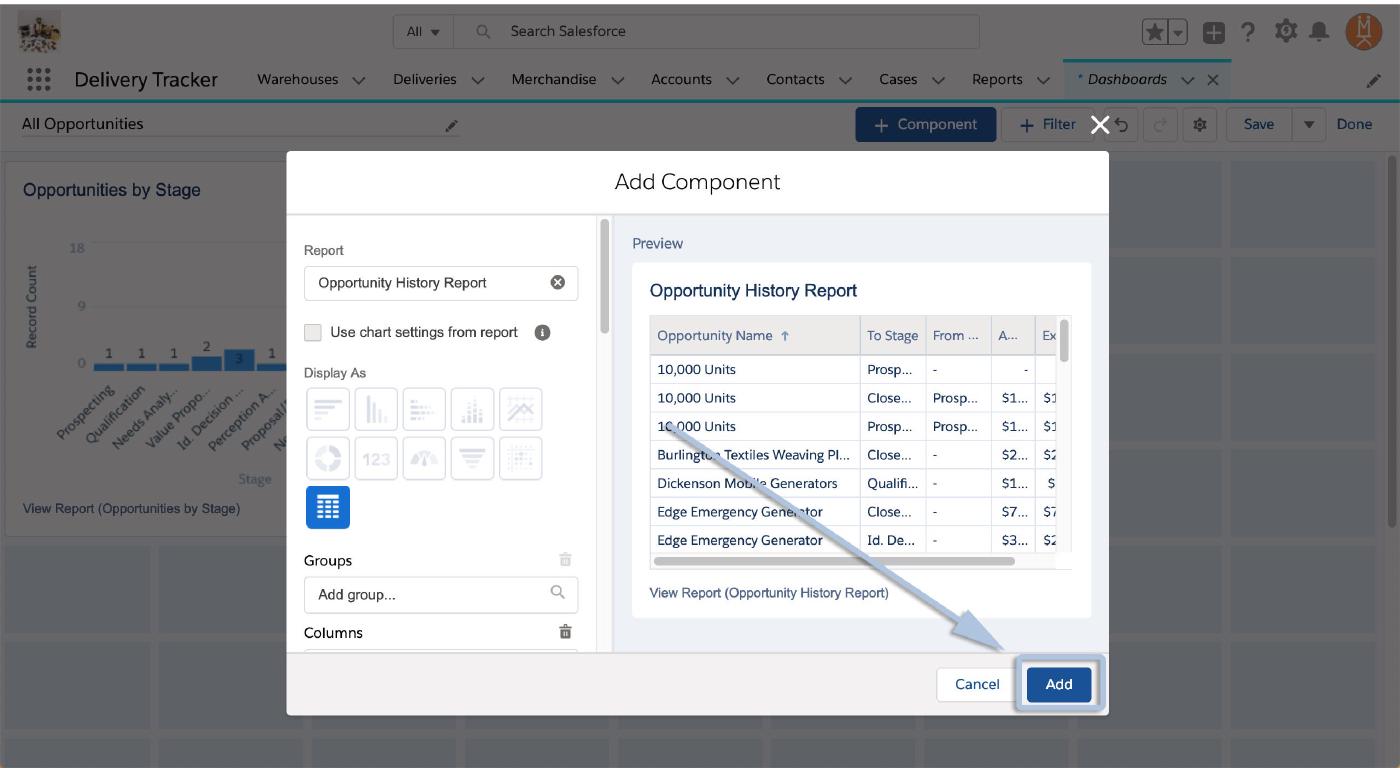
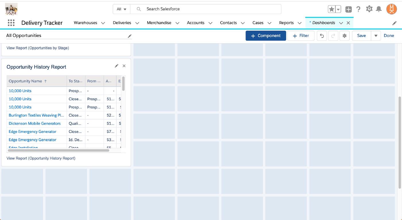
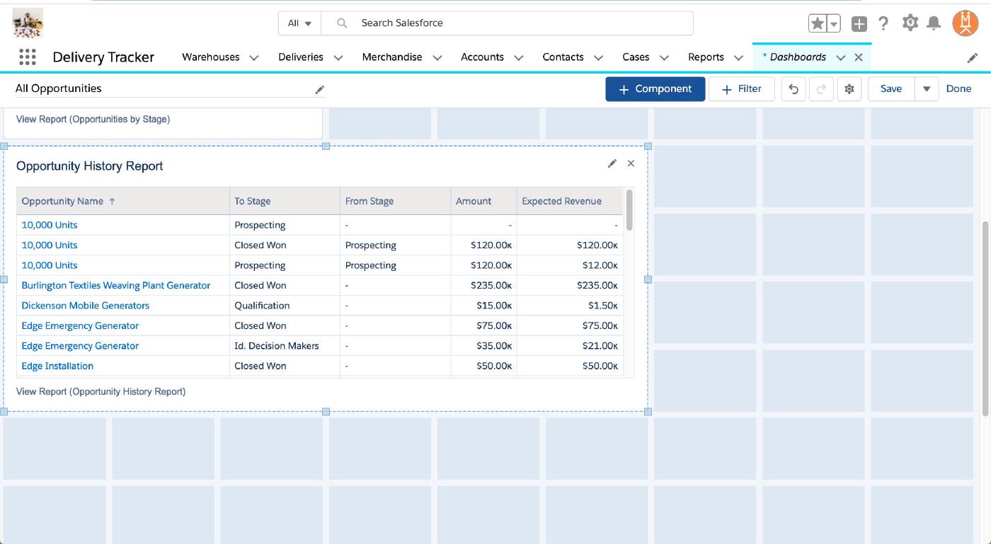
If, like on this Opportunity History Report chart, you’re seeing some of your data cut off by the chart’s edges you can resize it. Click once on the chart to select it. (You’ll know it’s selected when you see the bounding box and anchors appear in the corners and along the edges).
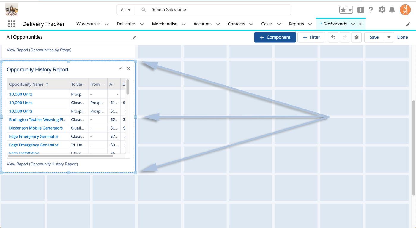
Then, simply click and hold the bounding box anchor you’d like to adjust and drag the chart out to the desired dimensions!
Now, repeat those steps to add all the components you’d like and we’ll walk through rearranging them on the dashboard!
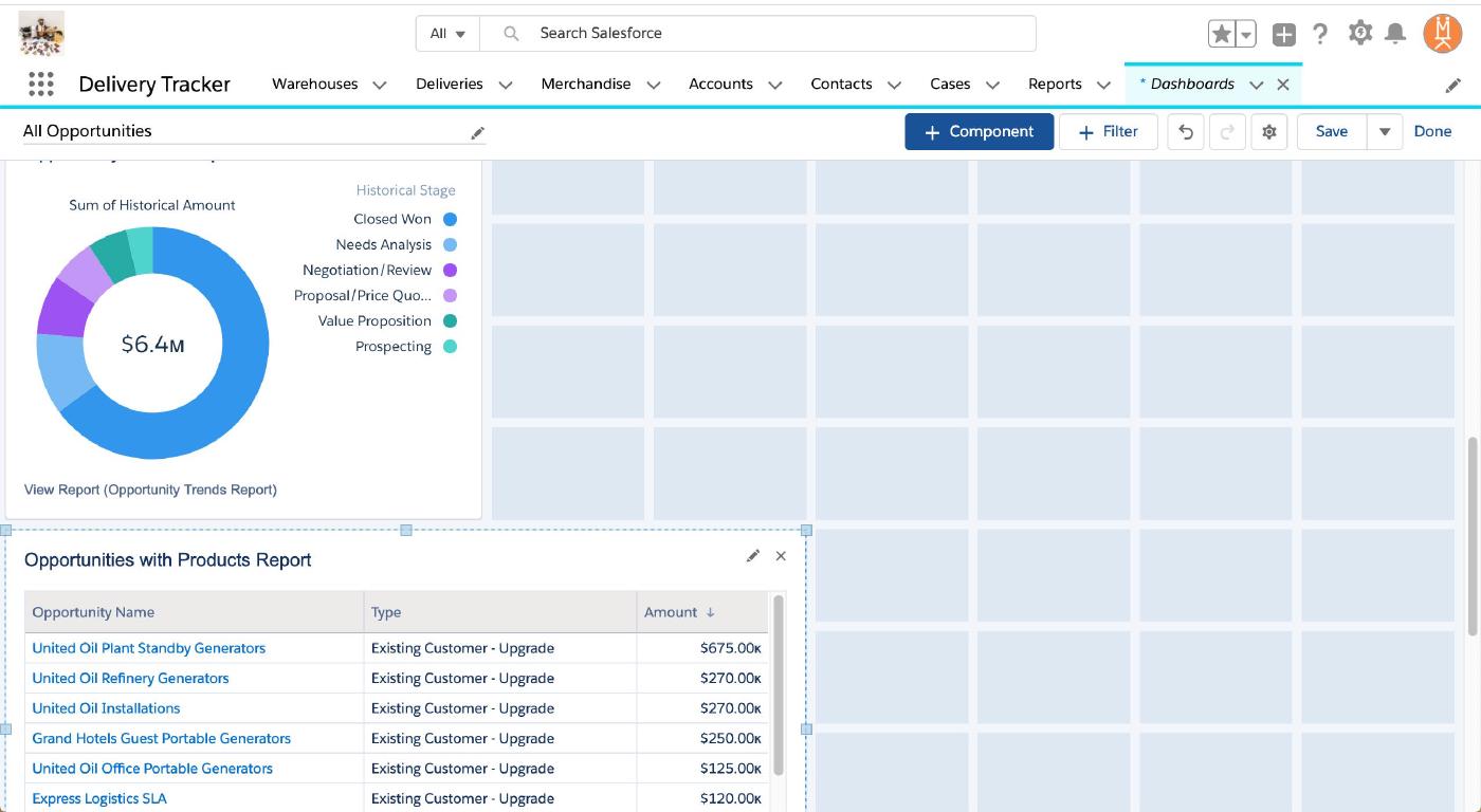
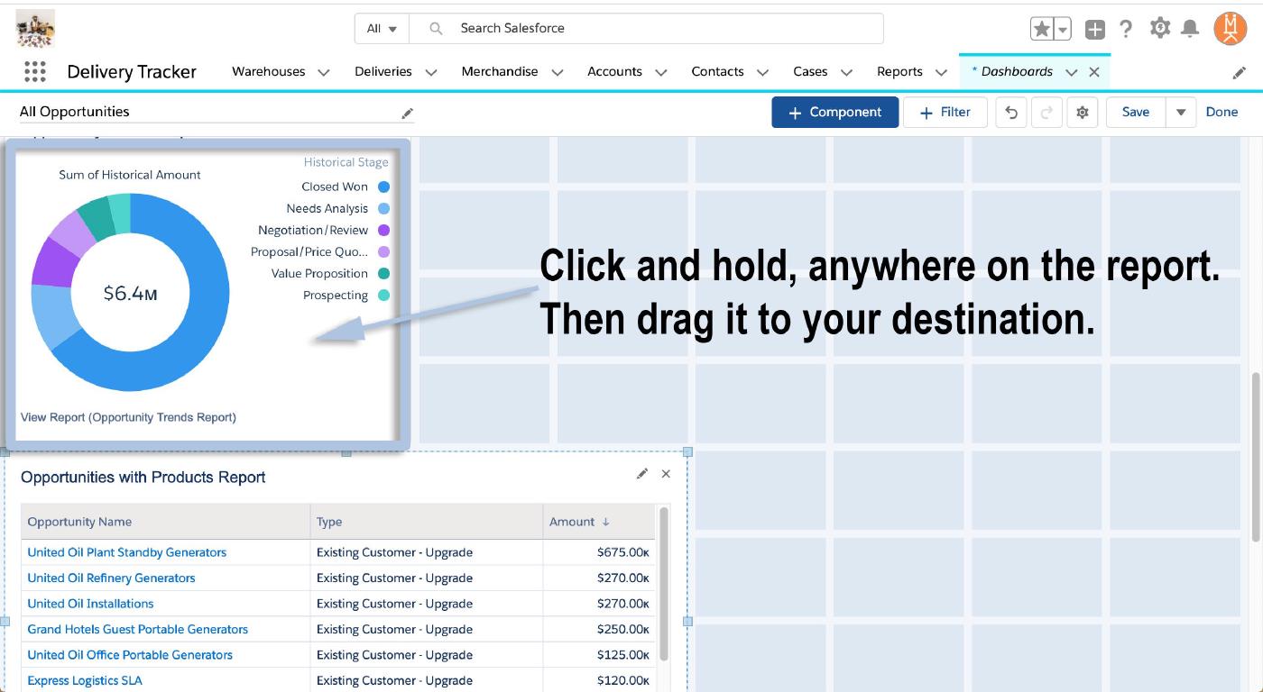
Once you have all your components added, rearranging them is as easy as clicking and dragging. Hover your mouse over the component you’d like to move then click, hold, and drag it to the spot you’d like it. The other charts will jump around and get out of the way automatically.

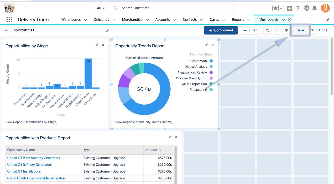
And once again, hit “Save” in the top right when you’re finished.
And you’re all set! Your new dashboard is ready to to roll out!
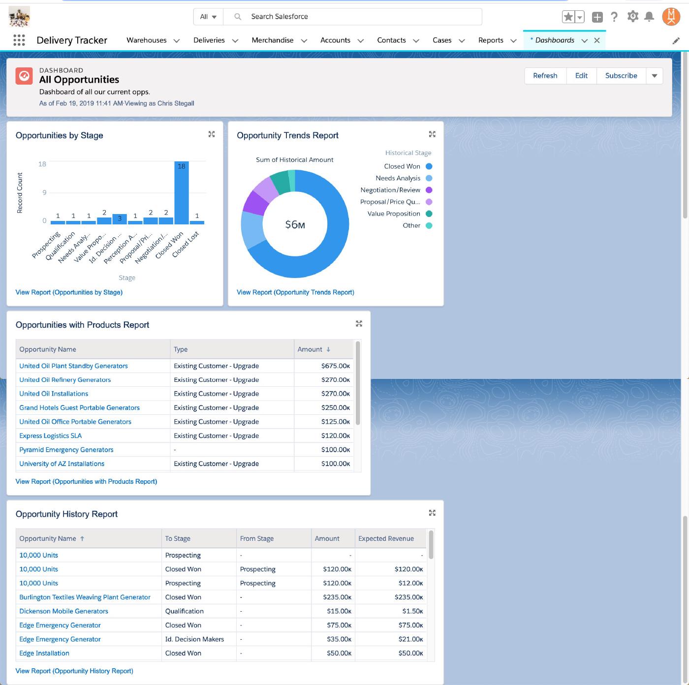
Congratulations! Dashboards are a great real-time tool for meetings and presentations, aligning goals across teams, tracking individual progress, and more!
And stay tuned right here for more installments of the Salesforce “How to” ABCs! Until then, keep working hard, smart, and happy! We’ll see you in the cloud.